Responsive Design:
Using CSS Media Queries, the layout is adjusted according to the viewing size. This ensures that accessing on either phone, accessing the website on a desktop, will always present an optimal view.
HTML Structure:
The content of the website is structured using HTML5. It includes sections such as;
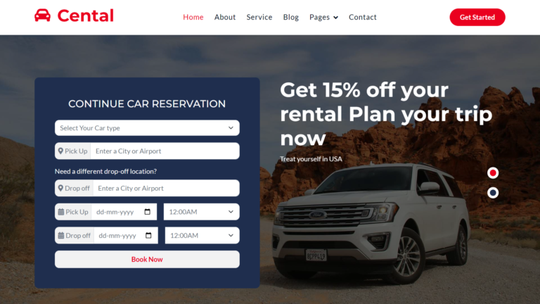
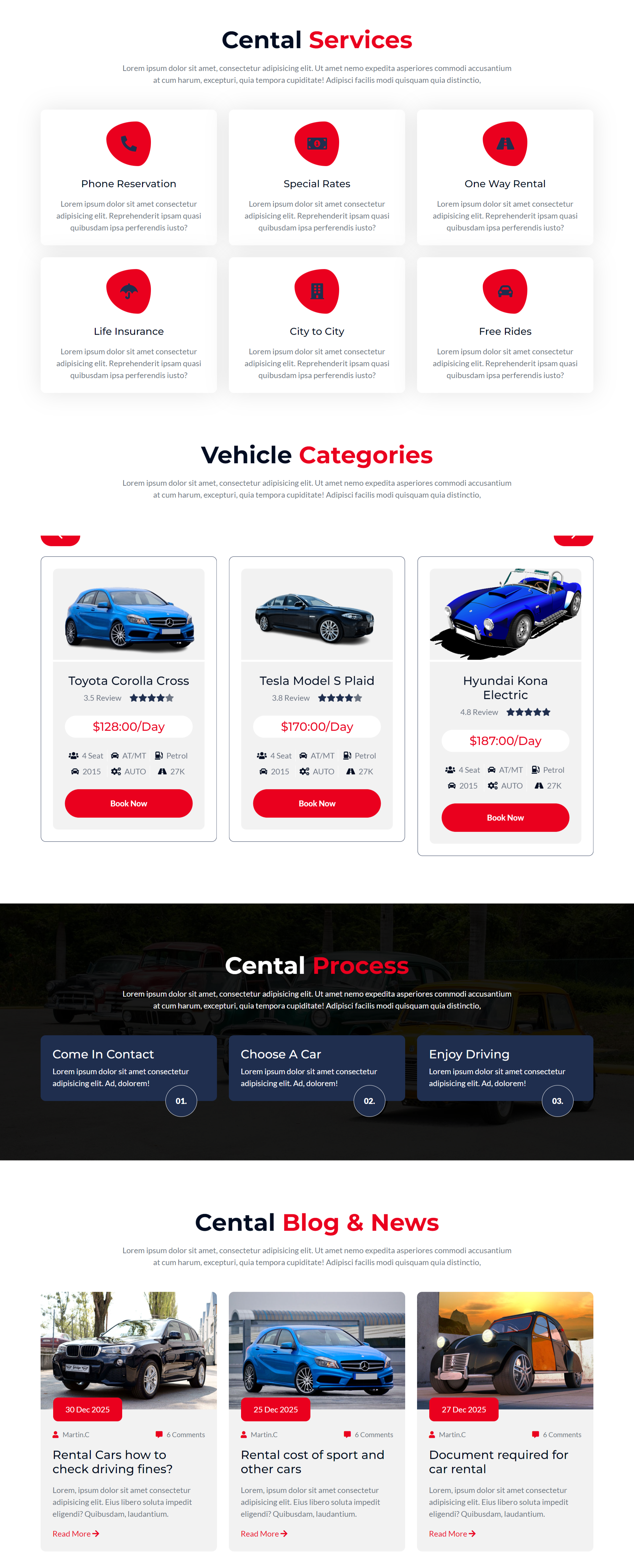
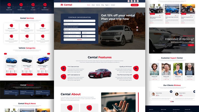
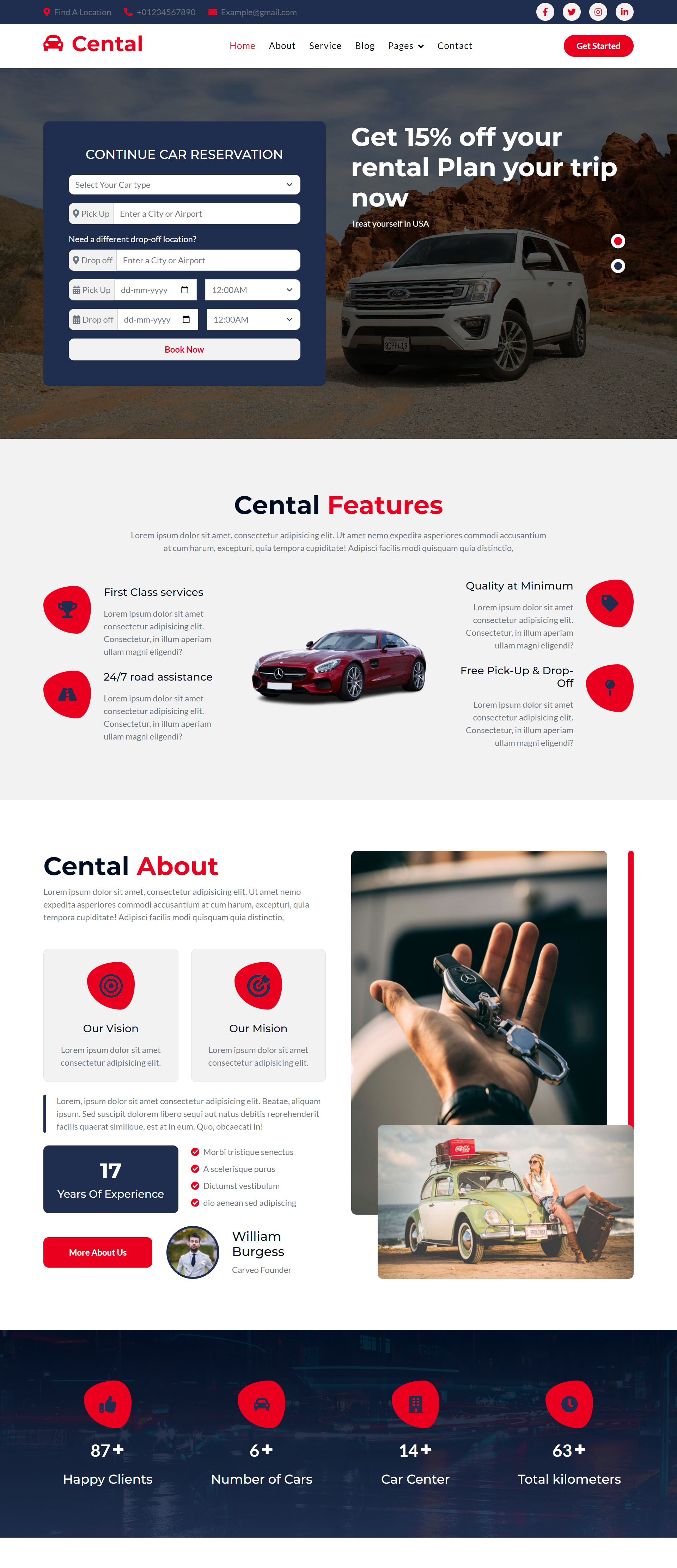
Home: This focuses on the highlighted services, featured cars, and lets you rent now.
Car List: A full page, showing all the available cars so users can look through them, type, model, price, or feature them.
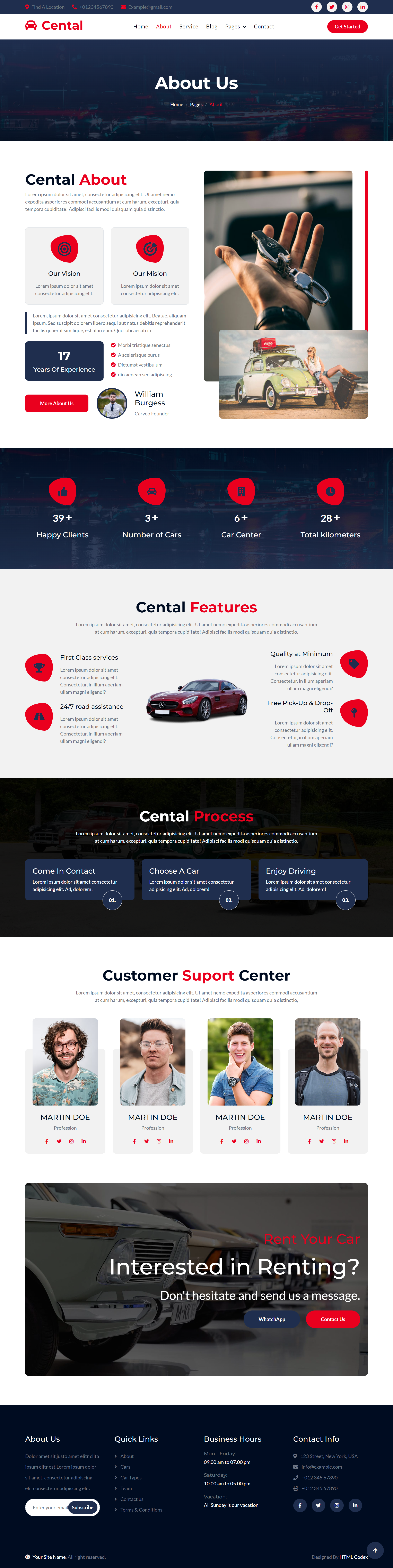
About Us: Facts about the company, in terms of history, mission, and vision.
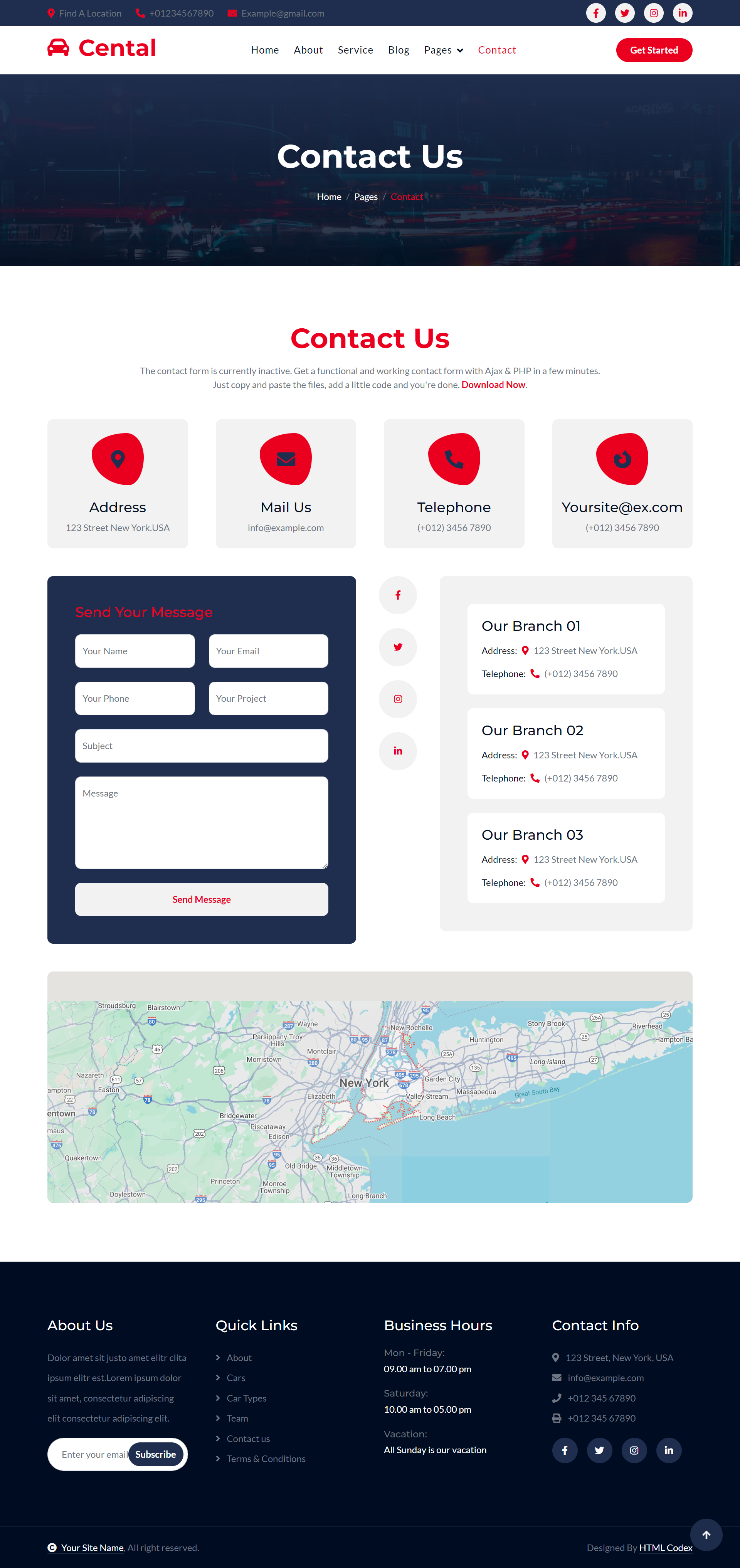
Contact Us: A contact form to which the customers can reach out for questions or requests.
CSS Styling
It is designed with CSS3. This includes:
flexbox and grid, therefore responsive layout.
hover effects, to make interactive buttons and links.
Fonts and Icons customizing to give the more attractive look.
Animations and Transitions : The use of animations to make the interface come alive.
JavaScript Interactivity:
The website will utilize JavaScript for dynamic functionalities, which are
Real-time car availability: either through fetching from the back end or using mock JSON data.
Search and Filter There should be a search bar where a user can find cars according to keyword and filters to narrow down what the person is looking for according to his preference. Booking Form Validation Form validation to verify if the user is giving correct details before he can submit a booking.
Car Sliders and Image Galleries: Display car images with sliders or lightboxes as an engaging, slideshow layout.
Booking System:
A booking form allows a customer to select a car, specify rental dates and provide his contact information.
JavaScript validation will be implemented on the mandatory fields so that users cannot leave fields empty.
Mobile-Friendly Navigation Bar
For mobile devices, there may be a hamburger icon that will make it highly convenient for users to browse through smaller screens while the larger screens use the standard navigation bar on top.
SEO Optimization
Semantic HTML tags like <header>, <section>, <article>, and <footer are used to utilize SEO, which will index the website through search engines.
Footer with Social Media Integration:
The footer includes links to social pages and possibly a newsletter signup for promotions and offers.


